New chart: Yearly display share
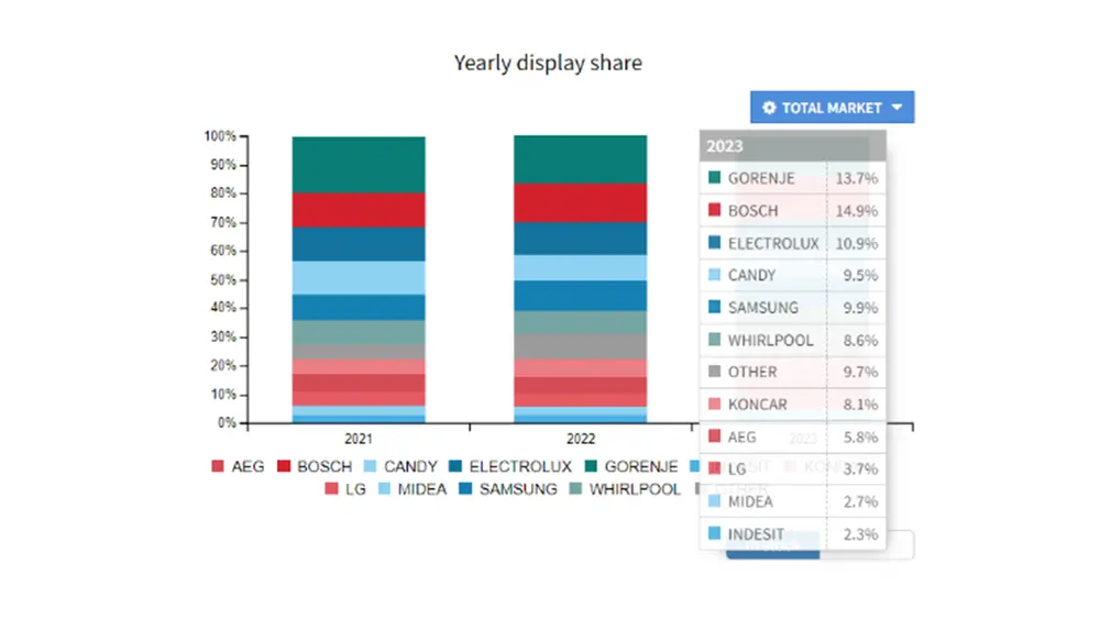
We recently added a new graph in KLIKER market: yearly display share.
Since it's time for quarterly business reviews, that graph comes in very handy because it shows the dynamics of display share (digital shelf share) between selected brands year-on-year.

Brands and vendors track their share YoY
The target group for this graph is brands - vendors or manufacturers that need to know how much their brand or product category is represented in the key retailer's online offers. Also, users can be the retailers who can make a competitive analysis of themselves concerning the market or key competitors with a few clicks.
Challenges
The challenge every sales organization faces is to understand their market position.
It is therefore interesting that all commercially available reports always present the past period. While the Yearly display share graph in Kliker shows 2 years back, it also gives the position in the current year which is a key competitive advantage not only of this functionality but also of KLIKER market as a platform compared to all other market intelligence companies.
About graph
The applications of the graph are numerous, from the fact that with a very simple export of the graph, it can be added to the presentation deck, which shortens the time required for its creation in PowerPoint, to the fact that by selecting an individual retailer we can understand the dynamics of market share growth and expansion opportunities with certain market participants.
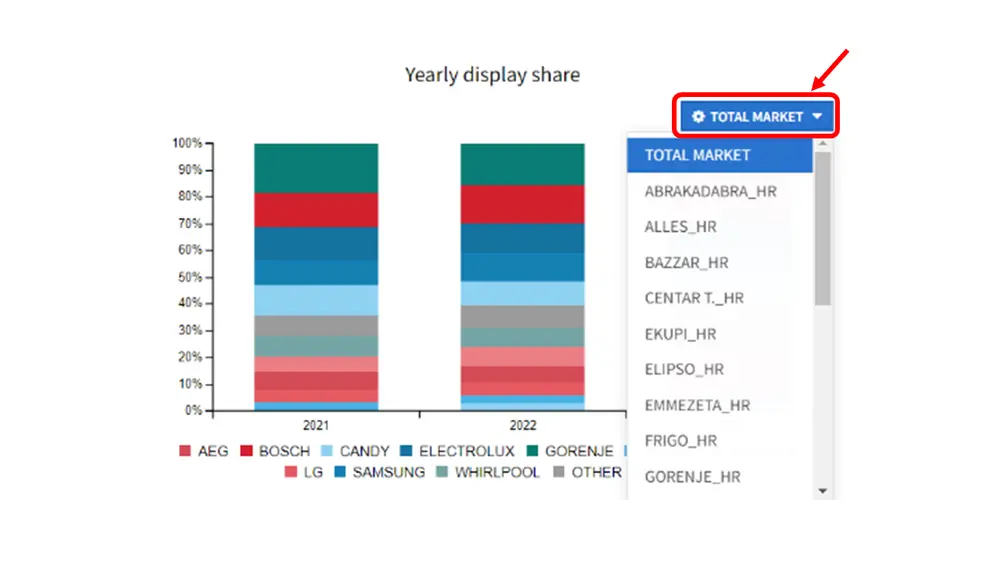
Above the graph, on the right, there is a function of the drop-down menu under the name 'Total market'. It gives us an overview of the entire market or a selected retailer.

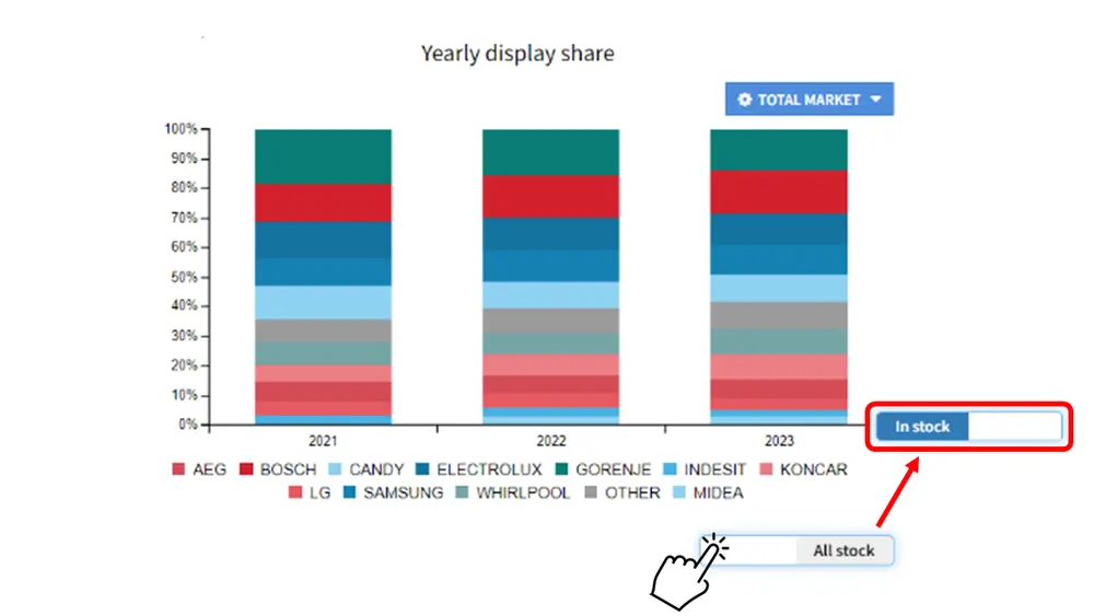
Also, on the right below the graph, there is a slider that offers 2 options: 'All stock' or 'In stock'. By selecting 'All stock', the graph will show all products, and by selecting 'In stock', only those products that can be added to the basket.

The new functionality is very easy and intuitive to use because it follows the previous way of presenting data, design, color selection, and methodology. The greater value of this functionality comes through a well-rounded understanding of one's own position on the market through various graphic displays, whereby this new graph provides an overview on an annual level, which in most cases is also the period used for comparison.
These are just some of the possibilities that KLIKER offers and if you are interested in the wider picture:
Read more:
- Market pricing deviations after conversion to euro
- Importance of Market Data during the Business Planning Process
- Introducing Marketplace product tracking
- KLIKER telco: All telecoms in one place
